
Over the years of working with the Divi theme from Elegant Themes, one of the most common complaints I hear is the fact that, by default, the full-width slider module is not responsive (“mobile-friendly”). This causes the background images to be cropped on certain screen sizes. Divi is by far the most popular and powerful themes on the market. If your thinking about starting a WordPress website design, I highly recommend you do it with this amazing theme.
In this Divi theme tutorial, I am going to show you a fairly simple way to make the full-width Divi slider responsive.
Here are the steps to complete this tutorial:
First of all, you will need to resize/crop all of your photos for the slider, so that they are all the same size. To do this, you will need some sort of photo editing software such as Photoshop, Gimp, or PaintShop Pro, just to name a few of the many programs available. We have found that 1200 x 400 pixels works well for full-width slider photos, but you can use whatever size works best for you.
Next, you will need to add a full-width section to the Divi Builder and then add a full-width slider module (see the two screenshots below).
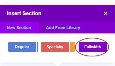
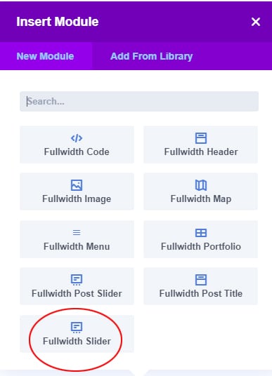
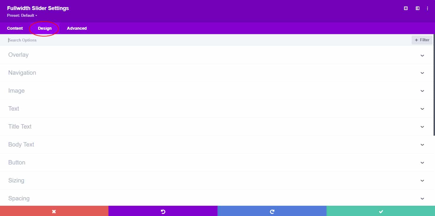
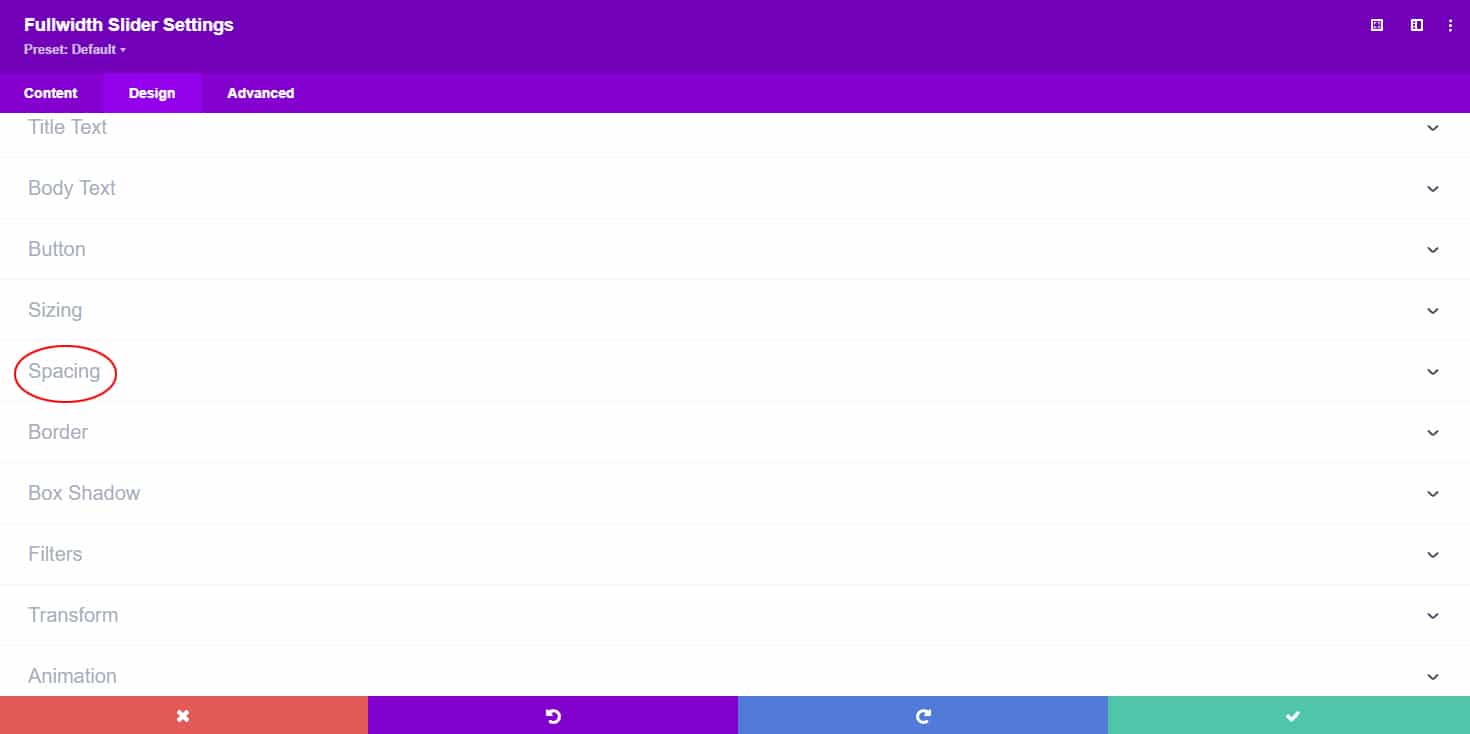
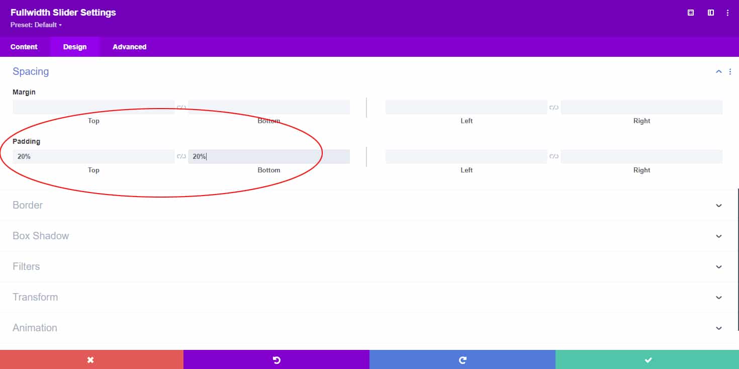
Next comes the important step that will make your slider scale correctly, without cropping your photos. In your main slider settings (under Advanced Design Settings), set your top and bottom padding to a % (see screenshot below). I have found that 20% – 25% works best, but you can adjust this to whatever looks best to you.
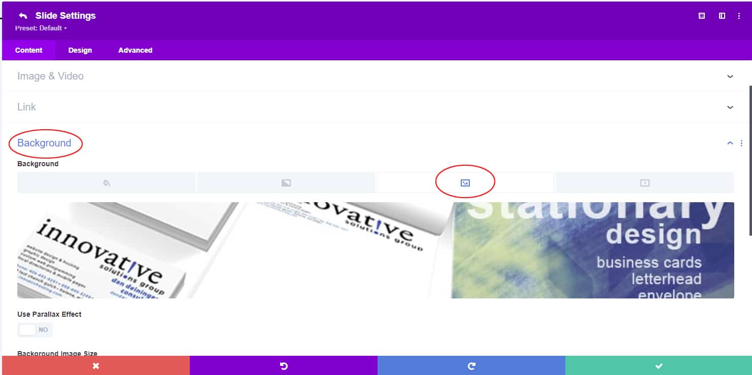
Next, you will need to add your slides and set your slider photos as the background image for each slide (see screenshot below).
You can see how this tutorial works in the example slider below. If you minimize your screen and slowly adjust the size, you will see that the slider scales with your screen.
I hope you have enjoyed this tutorial and found it useful!
Please feel free to contact us if you ever need help building your Divi websites.
Having trouble, or just want to save time and have us fix your Divi slider for you?
We’re happy to help and for a limited time we’re offering this service for only $75.00!
Complete the order form below, and we’ll have your slider looking perfect on any screen size or device within 24 hours.
Responsive Divi Slider Order Form
Complete the form below, make your payment and we'll get started. We will have your slider updated to look great on any screen size within 24 hours.


Great! Thanks a lot!
If you click on the mobile icon at the end of the padding setting, you can even set it different for Desktop and tablet/smartphone.
This solved my issue instantly, wonderful.
You’re most welcome, glad it worked for you!
Followed your steps with no result. Using Divi 3
My bad! I had earlier set the parallax to “on” and that was affecting the responsiveness.
Glad you got it figured out!
Thank you very very much!
You are a rockstar! I have searched for two days on info on how to do this.
Thank you!!!!!
Glad it helped you Lauren!!
Hi! I tried this tutorial but it doesn’t work. What am I missing? Here’s the link: http://ybdonline.greenonfire.com
Adding text seems to cause problems with this. I would suggest either adding the text directly to your photos or creating the text as a graphic and displaying it that way. That’s what we’re doing here – https://emakki.ca/
Hope that helps!
I did all of the steps correctly, but my header text is now at the very top of the images instead of in the middle. Any thoughts?
Adding text seems to cause problems with this. I would suggest either adding the text directly to your photos or creating the text as a graphic and displaying it that way. That’s what we’re doing here – https://emakki.ca/
Hope that helps!
Thanks! CSS worked for me on Divi 3
Glad it helped you Kristina!
Hi, unfortunately I cannot find the top and bottom padding in divi 3…
Hello Alex,
Padding is now under the “Design” tab under “Spacing”. You also need to go into each slide and make sure the background size is set to “Cover”. I need to update this tutorial, just haven’t had time lately.
Hope that helps!
>Padding is now under the “Design” tab under “Spacing”. You also need to go into each slide and make sure the background size is set to “Cover”. I need to update this tutorial, just haven’t had time lately.
————————————————————-
Thanks so much for mentioning this. I couldn’t understand why there was no difference, but once I did this it works fine!
You’re welcome Mike, glad to help!
After scanning the support requests on the official Elegant Themes site, I wasn’t able to come up with a simple solution that worked as well as yours.
Thank you so much for sharing your expertise!
Glad it helped! I still need to update the tutorial for the latest Divi updates, but you must have figured it out. 🙂
Mine worked but now I am having issues with the link on mobile devices. On the desktop, links in the slider work just fine. But on mobile devices, the links will not work. Any suggestions?
Hello Emily,
Happy New Year!
I would need to see how you’re doing the links, but I have used this technique before and it worked for me – https://www.elegantthemes.com/blog/divi-resources/how-to-add-links-to-divi-fullwidth-slider-images-divi-nation-short
Hope that helps!
~Dustin
Dustin,
That is the exact tutorial I used to add links to background images in full width sliders. The links work fine on a desktop, but you can’t click them on a mobile device. I am wondering if a CSS code needs to be added for the button link option to be able to tap it instead of clicking it?
Hey Dustin and Emily,
We are experiencing the same problem with links on the slider not working within mobile view, the links work perfectly on the desktop and tablet, just not a phone. We have been unable to solve the issue. Were you able to find a fix?
Hey Emily and Dustin,
Just wanted to add a quick update to my previous issue. I checked out the link given to Emily by Dustin and started a chat with one of the associates online. She gave me code to input in the Theme options > general settings and it did fix the link issue, but it skewed the slide images to where they were cropped and unreadable. I shared this info with the lady in chat and she was unable to help fix that issue. So I removed the code for now. So, if you have any input on this, we’d be ever so grateful! The code she gave me was:
.et_pb_slide .et-hide-mobile {
display: block !important;
}
There is an option under the advanced tab to “Show CTA on Mobile”, if that’s switched off, it may be why your links aren’t working.
Lifesaver. Thanks
Glad it helped!
Good Job, It works Great.
Glad it worked for you!
Thanks for sharing. Unfortunately is not working for me. I tried removing the text from the sliders. Backgrounds are set as cover. Still images on slider are way cropped on mobile. May be I´m missing something…?
Hello Eliana,
Sorry to hear it’s not working for you. I looked at your site and it appears that you’re not using the full-width slider module. The tutorial is meant for that module. If you switch to the full-width module, it should work for you.
Need help with making the slider mobile responsive please, I tried doing the tutorial but it’s not working
Hello Alyssa,
It looks like you have a height of 850px set for the slider. You’ll have to remove that and set your top/bottom padding to a % (Example: 25%).
Hope that helps!
Hey Dustin,
Thanks for posting this article, but I can’t seem to get the slider to display properly. The link to my site is http://www.kcmetroair.com/home. Any chance you could help me out?
Hello Trent,
I believe it’s the text/buttons in your slider that’s causing not to work.
Hi Dustin,
i have an Fullwith Slider on my Page.
For Desktop is the Picture size okay, but on Tablet and Mobile is totally crazy
What can i do?
Hello Rene,
Your photos actually look okay to me on mobile. You could try making them a little smaller to improve the quality.
All the best,
Dustin
Genius! Worked perfectly. I had to make a little adjustment in the bottom padding but that was all. Thanks for this solution. I tried numerous other fixes until i came upon this one. Thanks again!!
Glad it helped! 🙂
Hi Dustin,
I tried your solution on my website and it worked great. But now I’m having issues with it on another website where it just doesn’t seem to be working. The website is: medical-promotion.de
Maybe you have a solution for me or a tip where it might be going wrong? Thanks so much!
Hello Sonja,
Glad the tutorial helped on one of your websites!
It looks like the slider on your 2nd website is using a button and text. I haven’t found a good way to make the slider responsive when using buttons/text. I would suggest just creating a second slider for mobile that is a simpler version.
Thanks for the quick reply, creating a second slider for mobile devices using just a button (no text) worked!
You’re most welcome, I’m glad it worked for you!
Today I tried to use your code on Divi v.3.21 but failed.
I have a really fullscreen slider with 1920×1080 images in it.
If I add 22 or 25% to the top and bottom paddings, slider jumps down from the above section and all looks not good.
And if to look at the mobile or tablet view we can see huge pixelated images and a mess.
I thought 22% in desktop view only was a cause of it and removed it and then added it to the mobile and tablet view top&bottom paddings – no use.
I do not understand where the problem…
Thanks.
Hello Eugene,
Sorry to hear it didn’t work for you. Are you using the full-width slider or full-width header module? The tutorial is written for the full-width slider.
If you have a button or text on top of the background image, this will affect the responsiveness. If this is the case, your best option is to make a duplicate of the section with a smaller background image, then set it to only display for mobile.
You could also try going to the “Advanced” tab and add this CSS code in the “Main Element” field: height: 56.25vw; (you will need to adjust the 56.25 to get it right for your images).
Hope that helps!
Thank you so much! Was finding this from a long time. 😀
Glad to help!
Thank you it helps a lot
Glad it helped you!
hi, not sure if the above is still applicable in year 2020. I followed all the steps but still getting different results from different browsers and different computers. For example, my slider is fine from my windows 10 laptop but when viewed from a macbook pro, the slider becomes cropped. can you help me please? thanks in advance
Hello Bill,
Yes, I need to update that tutorial, just haven’t had the time.
Try this – Go to the “advanced ” tab for each slide and enter this CSS for “main element” – height: 56.25vw;
You will probably need to adjust the 56.25 depending on the size of your images.
Note: this will not work if you have text or buttons in your slides.
Good Luck!
Hello! So I have tried pretty much everything to get my slider to be responsive, and nothing seems to be working, so I’m really hoping you can help! I’ve tried putting the 22% padding in both the individual slide settings under “Spacing” and under the Design tab for each Desktop, Tablet & Phone. I’ve added the height: 56.25vw; in the main element css for each slide. I’ve added the css in the Divi > Theme Options > General > Custom CSS field. Also added the CSS class in the slider settings. All 3 images are sized to 1200 x 400 (on the home page only). A huge thank you in advance!!
Hello Dianne!
It looks like you have a 400px height set somewhere –
.et_pb_fullwidth_slider_0, .et_pb_fullwidth_slider_0 .et_pb_slide {
height: 400px;
}
If you find that and remove it, you should have much better luck.
Good Luck!
~Dustin
Thank You, Thank You, Thank You!!!
Glad to help!
Thanks you saved my day!..
Glad it helped!
Hi all.. doing my best to be a success story on this one… but not yet… of course, client can only see the slider not being responsive so she thinks the whole site is not… 😉 I have deleted all full width sliders except for one until I get this…
any chance you can look at Landtitleprofessionals.org? Ive done everything and no joy yet… Thanks for keeping this LIVE.
Hello Keith,
Love the site, nice job!
I’m seeing this –
element.style {
height: 732px;
min-height: 732px;
}
Make sure you don’t have any heights set and the tutorial should work.
Good luck!
Where are you seeing that?
I did a right-click in chrome and selected “inspect”, it shows you the CSS/HTML code. It’s probably in your slider settings, either for the slider itself, or the individual slide settings.
Thanks Dustin… I’ll track it down.
Glad to help!
I have tried to follow this thread and instructions for making the full width slider responsive – but still not responsive on mobile device. I am a novice to web design and help a local non-profit. Any assistance would be greatly appreciated.
Hello Beverly,
It looks like you have a 350px height set on your slider. It won’t work with a height set, try removing that and you should have much better luck.
Dustin – by removing the height set it does allow for the slider to appear correctly on my phone – however now on the website it is very narrow and not all of the slider is visible.
You’ll need to adjust the padding to get your desired result.
Dustin – I was able to figure out adjusting the height for desktop & mobile separate. I think I’m all set – thank you for your help on this!!
Glad you figured it out Beverly!
Hi,
This doesn’t work with Mobile responsiveness. Can you help?
Hello Sanjana,
It appears that you may hive a height set on the slider, remove the height and it should work.
All the best,
Dustin
Hello Dustin,
I’ve tried to follow the instructions and still have issues with the responsiveness on both mobile and website. Please advise.
Many thanks,
Hello Omolaso,
Sorry to hear the tutorial is not working for you.
With your site being password protected, it’s hard to troubleshoot why it’s not working.
Try reading the other comments, a lot of the common issues are covered.
Make sure you don’t have a height set on the slider.
If you have text or a button in the slider, that can affect it as well.
Good Luck!
~Dustin
Hello Dustin,
Apologies, I missed your response. The Password has been removed. I did look at comments, but nothing helped. I did some other manipulation, but please take a look. Maybe I’m doing something wrong.
Thanks,
Laso
Hello Laso,
It looks like you have a height/min-height of 600px set somewhere. Remove that and the tutorial should work. You can’t have a height set and still have the slider be responsive.
Hope that helps!
~Dustin
Hello Dustin,
Thank you so much for your prompt response. The view looks great on tablet / phone, but now cutting off on desktop. I’ve tried % numbers between 20-25%.
Thanks again for your guidance.
Hello Laso,
I’m still seeing this –
element.style {
height: 490px;
min-height: 490px;
}
You can’t have any height set for the slider or individual slides, the padding as a % will control the height.
You may also want to set a color for your header background, so the slider displays below it and see if that makes a difference.
~Dustin
I’m suprised as i’ve removed all the height relevance. Let me inspect the codes again.
Thanks,
Laso
I noticed that your second slide in the rotation is working correctly. This means that you must have something set in the other individual slides that is causing them to not be responsive.
Hope this helps!
All the best,
Dustin
Hello! Hoping you have time to help me out. I tried your instructions and haven’t been able to make it responsive yet. Could you take a look?
Hello Lizzy,
It looks like you have a height set –
element.style {
height: 450px;
}
Remove that and it should work.
~Dustin
Hey Dustin,
Can you look at this home page slider?
I have tried various versions of your help from above. Slider is not being responsive.
Hello Tony,
It looks like you have a height (and maybe width set) –
element.style {
height: 840px;
}
You can’t have any heights or widths set. The top/bottom padding (as a %) controls the height.
Hope that helps!
Hi Dustin,
I followed you tutorial but i have no luck. Can you take a look?
Regards,
Ronald
Hello Ronald,
Sure, I’d be glad to take a look. However, your site is “coming soon”… Have a link?
I disabled the coming soon plugin. Can you check it again?
It looks like you have a 949px height set somewhere. Remove that and you should be good.
Good luck!
That is what i see to but when i go through the full slider setting i cannot see anywhere the 949px setting.
Without logging in and looking around, that’s about all I can tell you.
If you’d like, you can order the service, and we’ll log in and fix it for you.
All the best,
Dustin