
You’ve got eight seconds—literally—before visitors bounce. Make ’em count with intuitive navigation, mobile-responsive design, and lightning-fast loading (seriously, every 100ms delay tanks conversions by 7%). Guide their eyes with visual hierarchy, write copy that actually persuades, and nail your CTA buttons. Don’t forget accessibility and technical optimization for SEO. Track everything with analytics. These ten elements aren’t suggestions; they’re your conversion foundation. Stick around to see exactly how to execute each one.
Key Takeaways
- Intuitive navigation with clear menu hierarchy and labeling helps visitors decide within 8 seconds if your site deserves their attention.
- Mobile-responsive design with touch-friendly buttons is essential since 60% of web traffic originates from mobile devices.
- Fast loading speeds under 3 seconds are critical, as every 100ms delay decreases conversion rates by approximately 7%.
- High-converting CTA buttons use strong action verbs, strategic placement, and A/B testing to guide users toward desired actions.
- Trust-building elements including user testimonials, security badges, and social proof address visitor credibility concerns within seconds of arrival.

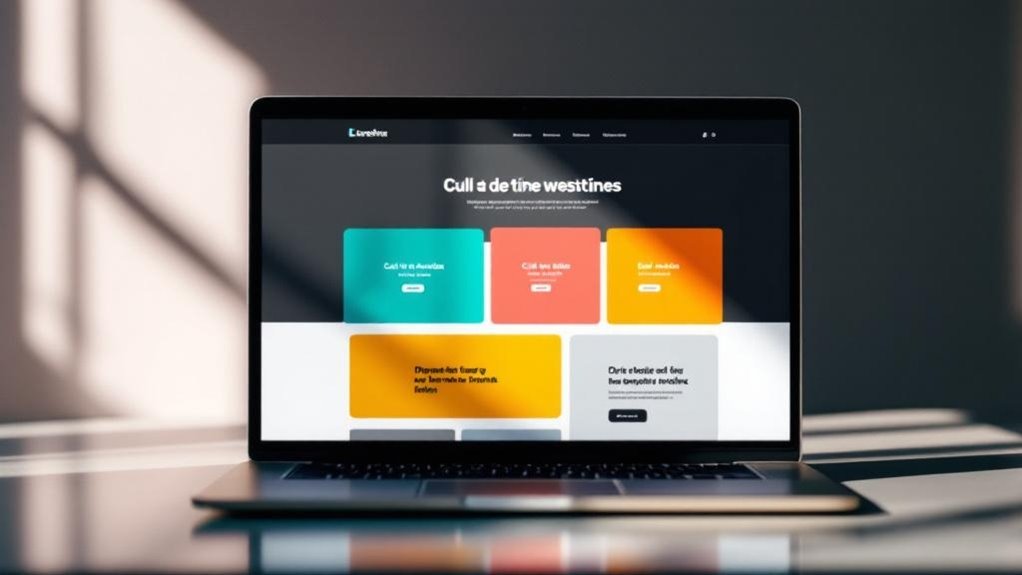
When visitors land on your site, they’ve got about eight seconds before deciding whether you’re worth their time—and honestly, that’s generous. That’s where intuitive navigation saves you. Your navigation structure isn’t just about looking pretty; it’s your user centric design backbone.
Clear labeling matters tremendously. Vague menu items like “Solutions” or “Resources” waste those precious seconds. Instead, be specific.
Strong menu hierarchy guides visitors naturally. Dropdown menus prevent overwhelming users with too many options upfront. Your content organization should follow user pathways—how folks actually think and search. Tools like Google Business Profile optimization help ensure your content aligns with how users actually discover and navigate your business information.
Quick access to important pages reduces frustration. Test your setup with real user feedback rather than guessing. A seamless experience isn’t accidental; it’s deliberate.
When navigation works invisibly, users stay longer, explore deeper, and convert better.
Mobile-Responsive Design That Works Across All Devices
You’ve probably noticed how your site tanks when someone opens it on their phone—turns out, 60% of web traffic comes from mobile devices, so flexible layouts that actually adapt to different screen sizes aren’t optional anymore.
Touch-friendly buttons and spacing matter more than you’d think (fat fingers are real), and when you nail the interaction design, users stick around instead of bouncing faster than a rubber ball.
The good news: responsive design isn’t some mystical dark art, just thoughtful planning that makes your site work whether someone’s viewing it on a 27-inch monitor or squinting at a 5-inch screen.
Flexible Layouts For Every Screen
Because roughly 60% of web traffic now comes from mobile devices, designing a website that actually works on phones, tablets, and desktops isn’t optional anymore—it’s table stakes.
You’ll want adaptive design strategies that automatically adjust layouts based on screen size. Flexible grids and proportional spacing do the heavy lifting here. Your content reflows smoothly instead of getting squished or cut off (you’re welcome, mobile users).
Responsive layout benefits aren’t just theoretical. You’re talking faster load times, better user engagement, and seriously improved SEO rankings. Google literally prioritizes mobile-friendly sites. That’s not a suggestion—that’s algorithm fact.
CSS media queries let you customize experiences at different breakpoints. Tablet visitors see three columns. Phone visitors? One column that actually fits. Nothing fancy, just functional design that respects how people actually browse.
Touch-friendly interfaces aren’t just about making buttons bigger—they’re about respecting how people actually interact with their phones. You need adequate finger spacing between touch targets. That means 48 pixels minimum for button size (industry standard).
Your swipe navigation should feel natural, not clunky. Gesture controls like pinch-to-zoom aren’t optional anymore—they’re expected.
Here’s what actually matters:
- Intuitive design reduces cognitive load. Users shouldn’t hunt for where to tap.
- Tactile feedback confirms actions happened. Vibrations and visual responses build confidence.
- Accessibility features benefit everyone, not just people with disabilities.
Skip hover effects on mobile—they don’t exist on touchscreens. Instead, focus on touch gestures that mirror real-world interactions.
Your visitors are using their thumbs at awkward angles while walking. Design accordingly, and they’ll actually stick around.
Lightning-Fast Loading Speed: Why Performance Wins Conversions

You’ve probably noticed that waiting three seconds for a page to load feels like an eternity—and Google agrees, which is why they built Core Web Essentials (those metrics measuring your site’s actual speed experience) right into their ranking algorithm.
Here’s the thing: your visitors aren’t patient, and every 100 milliseconds of delay can tank your conversion rate by around 7%.
Speed Impacts User Behavior
While most websites claim to prioritize user experience, they’re actually losing customers the moment pages take more than three seconds to load.
You’ve probably experienced this yourself—that split-second decision where you abandon a crawling site for a competitor.
Loading delays trigger immediate user frustration, and honestly, visitors won’t stick around to watch your content load.
Here’s what actually happens:
- Bounce rates spike dramatically when performance metrics show slow speeds, directly creating conversion barriers.
- Search impact suffers because Google penalizes sluggish sites, tanking your visibility and customer retention.
- Website abandonment accelerates as speed optimization failures compound, bleeding potential revenue.
The truth? Speed isn’t just a nice feature—it’s fundamental to user behavior.
People expect instant gratification (fair or not), and your site’s performance directly shapes whether they stay or leave.
Slow equals lost.
2. Core Web Vitals Matter
Google’s Core Web Essentials are basically the report card your site gets graded on, and they’re the specific metrics that actually matter now.
These core web essentials measure loading performance, page stability, and visual responsiveness—the stuff that keeps visitors from rage-quitting your site.
You’re looking at three key measurements: Largest Contentful Paint (LCP), Cumulative Layout Shift (CLS), and First Input Delay (FID).
Nail these, and your bounce rate drops. Your engagement metrics climb. Your SEO impact? Legitimate.
Here’s the thing: accessibility standards and user experience aren’t separate anymore. They’re intertwined.
A slow site isn’t just annoying (it is, though). It’s literally costing you conversions. Google knows this. Your competitors know this. You should too.
3. Conversion Rate Optimization Tactics
Every millisecond counts—literally. Your site’s speed directly impacts whether visitors convert or bounce. Studies show that pages loading over 3 seconds lose roughly 40% of potential customers.
You’re not just competing for attention; you’re fighting physics.
Here’s what actually moves the needle:
- A/B testing different layouts reveals what your target audience genuinely clicks—not what you think they should.
- Behavioral analytics track engagement metrics showing exactly where users abandon your funnel (spoiler: it’s usually checkout).
- Content personalization powered by user feedback dramatically improves conversion rates through funnel optimization.
Persuasive design isn’t manipulation. It’s removing friction. Fast loading combined with streamlined navigation creates momentum.
Your visitors are impatient (fair), so respect their time. Speed wins conversions because it whispers: we value you.
Visual Hierarchy: Guide Users to What Matters Most
Because humans scan websites faster than they actually read them—we’re talking 5-10 seconds before deciding to stick around—visual hierarchy isn’t just some design theory your web guy mumbles about.
It’s your make-or-break moment.
You’re fundamentally creating a strategic layout that guides eyeballs where they need to go. Size matters. Color matters. Contrast matters. Bold headlines, whitespace, and directional cues work together to establish visual impact without screaming desperation.
Think of it like a roadmap. Your most important conversion goal—whether that’s a signup button or product feature—should be impossible to miss.
Not buried under three paragraphs of corporate jargon (we’ve all suffered through that).
When you nail visual hierarchy, you’re not hoping users find what they need. They will. Naturally. That’s the whole point.
Write Copy That Persuades and Converts
Your website’s copy either pulls visitors toward conversion or pushes them away—there’s rarely a middle ground.
You’ve got to ditch the corporate jargon and buzzwords (seriously, nobody needs another “synergistic solution”) in favor of clear, direct language that actually means something.
When you pair that clarity with action-oriented language—think “Start your free trial” instead of “Explore our offerings”—you’re not just being nice to your readers; you’re practically handing them a reason to click.
Clarity Over Complexity
Three things’ll kill your website faster than a slow server: confusing navigation, wall-of-text copy, and trying to sound like a Fortune 500 company when you’re just trying to sell something people actually want.
Your minimalist approach matters. Strip away the noise—your visitors’ve got maybe eight seconds before bouncing. A user focused design means respecting their time.
Here’s what actually works:
- Short paragraphs (two to three sentences max) that breathe on the page
- One clear call-to-action per section so people know what’s next
- Plain language that sounds like you’re chatting with a friend, not reading a manual
Cut the corporate jargon. Nobody’s impressed by unnecessarily complex vocabulary.
They’re impressed when you solve their problem in fifteen words instead of fifty.
2. Action-Oriented Language Matters
Words like “discover,” “unlock,” and “transform” get thrown around so much they’ve basically lost their teeth—but they work because they trigger something in our brains.
You’re wired to respond to action verbs. They make things feel *possible*.
Here’s where it matters: your call to action isn’t just a button. It’s the entire conversation you’re having with visitors.
Strong action verbs like “start,” “grab,” or “claim” beat wishy-washy language every time. Pair them with persuasive phrases that speak to actual benefits—not vague promises.
Your compelling headlines need to do heavy lifting too. They should spark curiosity without lying.
Clear messaging means you’re not making people guess what comes next. User engagement skyrockets when you respect their time and make the next step obvious.
Build Trust Instantly: Social Proof, Security, and Credibility Signals

When visitors land on your site, they’re fundamentally asking one question: “Should I trust you?”
Within those first few seconds, you’ve got to answer with more than just pretty colors and smooth animations.
This is where credibility signals do the heavy lifting.
You’ll want to showcase:
- User testimonials and reviews from real customers (ideally with photos and names—not generic “John D.”)
- Trust badges like SSL certificates, security seals, and payment verification logos
- Expert endorsements from recognized industry figures or publications
These elements aren’t fluffy decoration. They’re proof you’re legit.
When potential customers see that 47 people gave you five stars or that Norton verified your security, they relax. They stop second-guessing themselves.
That’s when conversion happens—when skepticism transforms into confidence.
Design High-Converting CTA Buttons: Placement, Color, and Copy Strategy
Don’t guess. Run effective A/B testing on everything: button size considerations, color combos, copy variations.
User behavior analysis reveals what actually works for *your* audience. That conversion funnel optimization you’re chasing?
It happens here, in these micro-decisions. Test relentlessly, measure results, iterate.
Make Your Site Accessible to Everyone (And Boost SEO)

As soon as you optimize for accessibility, you’re not just being decent—you’re actually unblocking better SEO and a wider audience.
Here’s the thing: accessible content isn’t some nice-to-have feature. It’s a business move. When you design inclusively, search engines reward you. Google literally ranks sites higher when they’re easier to navigate.
Plus, you’re tapping into 1 in 4 adults with disabilities who’ll actually stick around.
What matters most:
- Use alt text on images and proper heading hierarchy so screen readers work properly
- Make sure color contrast meets WCAG standards (not just pretty, but readable)
- Test with assistive technologies to catch what you’d otherwise miss
User feedback from real people matters here. They’ll tell you what breaks.
Listen to them. Inclusive design isn’t complicated—it’s just considerate.
Technical Optimization: Speed, Crawlability, and Rankings
Your site could be the most beautifully accessible thing on the internet, but if it takes six seconds to load, you’ve already lost half your visitors—and Google’s noticed.
Website speed isn’t just about making people happy (though that helps). It’s a core ranking factor now.
You’ll want to focus on crawl optimization—ensuring search engines can actually index your pages without hitting roadblocks.
Backend improvements like image compression, minified code, and proper server configuration directly impact loading efficiency.
Check your performance metrics regularly using tools like Google PageSpeed Insights.
Here’s the thing: technical SEO determines whether your content gets discovered at all.
User engagement skyrockets when pages load fast. Better performance metrics mean better rankings, which means more traffic.
It’s not glamorous work, but it matters.
Measure What Matters: Set Up Analytics and Conversion Tracking

All that speed optimization and crawl tweaking means nothing if you can’t track what’s actually happening on your site.
You’ve gotta set up real analytics infrastructure—Google Analytics 4, heat mapping tools, conversion tracking. Here’s what matters:
- Establish clear website goals and tie them to performance metrics that actually reflect your business.
- Implement A/B testing to gather actionable insights instead of guessing what your audience wants.
- Create audience segmentation to understand user behavior patterns across different visitor groups.
Your tracking tools aren’t just vanity counters. They’re the foundation for data driven decisions.
Set up a solid reporting framework that shows you conversions, bounce rates, and where users drop off. Then act on it.
Most sites collect data and ignore it (honestly, criminal waste). Don’t be that person.
Frequently Asked Questions
How Much Should I Budget for Professional Website Design and Development?
You’ll typically budget $2,500–$10,000+ for professional website design pricing, depending on complexity. Development costs vary based on features, functionality, and customization you’re requiring for your business needs.
What’s the Best Platform or CMS for Building a Website?
You’re climbing a mountain when choosing your platform. WordPress dominates CMS comparisons, while Shopify and Wix lead website builders. You’ll find each offers distinct strengths—evaluate your needs, budget, and technical comfort before deciding.
How Often Should I Update My Website Content and Design?
You should update your content regularly—at least monthly—to maintain content freshness and keep visitors engaged. Refresh your design quarterly to align with current design trends and guarantee you’re staying competitive in your industry.
Do I Need a Blog to Improve My Website’s SEO Performance?
You don’t need a blog, but you’ll benefit from one. A strategic blog improves your SEO through fresh content, establishes authority, and drives organic traffic. Your content strategy determines success—consistent, quality posts outperform sporadic updates.
How Can I Choose the Right Color Scheme for My Brand?
You’ll choose the right color scheme by understanding color psychology and how it aligns with your brand identity. Select hues that reflect your values, resonate with your target audience, and differentiate you from competitors.
Final Thoughts
You’ve got all the pieces now. You’ll notice the best sites aren’t fancy—they’re *functional*. As they say, you can’t polish a pig. So you’re building something genuinely useful, measuring results (not just guessing), and staying accessible to everyone. That’s not revolutionary stuff. But when you nail these 10 elements? You’ll convert more visitors into customers. Your competition probably won’t do this work. You should.
Ready to implement these essential elements? Contact Innovative Solutions Group today. With over 30 years of experience in website design and digital marketing services, we know exactly how to transform your site into a conversion machine.
Let’s get started:
Phone: 406-495-9291
Email: iteam@inovativhosting.com
Website: https://inovativhosting.com
Don’t let your competitors win. Reach out now and discover how we can build something genuinely useful for your business.


