
To turn visitors into customers, you need five design principles working together. Use visual hierarchy to guide eyes toward your CTAs, because color and layout directly influence purchasing decisions (85% of shoppers buy based on emotional color responses). Keep load times under three seconds—anything slower tanks conversions fast. Add social proof near your CTAs, design buttons that demand clicks, and strip out every distraction. Stick around, because each principle gets more actionable from here.
Key Takeaways
- Strategic visual hierarchy using contrasting colors and smart layouts guides visitors toward CTAs, boosting conversions significantly.
- Fast-loading, mobile-optimized websites reduce abandonment rates, as pages exceeding three seconds lose 53% of mobile visitors.
- Placing customer testimonials, trust badges, and security certifications near CTAs builds credibility and increases buyer confidence.
- Action-oriented CTA buttons with urgency, proper sizing, and tested placement dramatically improve click-through and conversion rates.
- Minimalist, clutter-free designs eliminate distractions, simplify decision-making, and keep visitors focused on your primary offer.
Use Visual Hierarchy to Push Visitors Toward Action
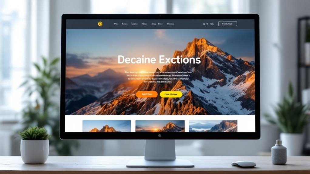
Visual hierarchy is the secret sauce behind websites that actually convert—and no, it’s not just about making your headline bigger than your body text.
It’s about controlling where your visitor’s eyes go first, second, and third. Strategic visual focus guides attention toward your call-to-action before anything else competes for it.
Think of it like a roadmap you’re drawing for people who won’t read instructions.
Contrasting colors aren’t decoration—they’re direction. A bright orange button against a white background screams “click here” louder than any copywriter can.
Nielsen Norman Group research confirms users scan pages in predictable patterns, so you’d better place your most important elements where eyes naturally land.
Research suggests that 85% of shoppers(link) are more likely to purchase a product when the color scheme on a website evokes the right emotions, making your color choices as strategic as your layout decisions.
Stop leaving that to chance.
How Page Speed and Mobile UX Directly Kill Conversions
If your website takes more than three seconds to load, roughly 53% of mobile visitors have already left—they didn’t bounce, they ghosted you.
Loading time isn’t a technical detail; it’s a conversion killer wearing a disguise.
Poor mobile responsiveness tanks user engagement faster than bad copy ever could.
Here’s what’s silently destroying your numbers:
- Tiny tap targets that make buttons impossible to click
- Uncompressed images slowing your loading time to a crawl
- Broken layouts that punish anyone not on a desktop
- Confusing menus that make intuitive navigation feel impossible
A high bounce rate usually means mobile UX failed first.
Fix that before obsessing over button colors.
Google’s Core Web Importance score directly ties page speed to search rankings—so slow sites get punished twice.
In e-commerce especially, a two-second load time can drive abandonment rates as high as 87%, meaning the majority of your potential customers never see your offer.
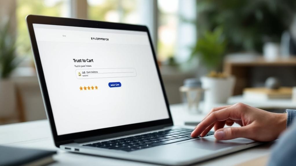
Use Social Proof and Trust Badges to Convert Skeptical Buyers
Once your site loads fast and looks great on mobile, you’ve cleared the first hurdle—but skeptical buyers still need a reason to trust you.
Drop customer testimonials near your CTA buttons, not buried at the bottom. Display review ratings prominently—4.8 stars from 300 customers hits differently than “we’re great, trust us.”
Add expert endorsements and influencer partnerships for borrowed credibility. Case studies showing real results (like “reduced costs 40% in 60 days”) convert better than vague promises.
User generated content—actual photos from real customers—builds authenticity that polished ads can’t fake. Slap security certifications like SSL badges and McAfee seals near checkout.
Include transparency policies so buyers know exactly what they’re agreeing to. Keep in mind that reviews influence local rankings on platforms like Google and Yelp, making visible customer feedback a dual-purpose asset that builds trust and improves your search visibility at the same time. Trust isn’t assumed. It’s earned through visible proof.
Design Every CTA to Demand a Click
Your CTA button is doing one job—getting clicked. So stop treating it like an afterthought.
Color psychology matters more than most designers admit—orange and green buttons consistently outperform gray ones (shocking, right?). Contrast is everything. If your button blends into the page, you’ve already lost.
Smart CTA placement means testing above the fold, mid-scroll, and post-content. Don’t guess—test.
Here’s what separates clickable CTAs from ignored ones:
- Use action verbs: “Get My Free Guide” beats “Submit” every time
- Create urgency: “Only 3 spots left” moves people
- Size matters: Too small gets ignored, too big looks desperate
- White space: Give your button room to breathe
Pairing strong CTAs with an SEO-optimized theme ensures your page loads fast enough that visitors actually stick around to click them.
Make it impossible to miss. That’s literally the whole assignment.
Cut the Clutter to Increase Website Conversions

Every extra element on your page is secretly working against you.
That navigation menu with 11 options? It’s paralyzing visitors instead of guiding them.
Minimalist layouts aren’t just aesthetically pleasing—they’re conversion machines. When you strip away the noise, visitors actually focus on what matters: your offer.
Minimalist layouts don’t just look clean—they convert. Strip the noise, and visitors finally see what you’re selling.
Focused messaging works the same way. One page, one goal. Not three goals. Not “kind of one goal with some extras.” One.
Amazon discovered that removing distractions from product pages increased purchases by nearly 28%. That’s not coincidence—that’s clarity doing its job.
Audit your homepage ruthlessly. Every banner, widget, and secondary link is competing with your CTA for attention.
(Spoiler: your CTA usually loses.) Cut the clutter, and watch your conversions climb.
The same principle applies to your forms—long complicated forms cause users to abandon the process entirely, so only ask for the essential information you truly need.
Frequently Asked Questions
How Do Color Psychology Principles Influence Visitor Purchasing Decisions on Websites?
Color associations trigger emotional responses that influence your buying choices. When you see red, it creates urgency, while blue builds trust. These emotional triggers subconsciously guide your decisions, making you more likely to purchase.
What Role Does Website Typography Play in Improving Overall Conversion Rates?
Like a melody guiding your ear, typography hierarchy and font readability orchestrate your visitor’s journey. You’ll convert more customers when your text flows effortlessly, making every word count and every message crystal clear.
How Often Should You A/B Test Your Website Design for Optimal Conversions?
You should run A/B frequency tests continuously, analyzing testing metrics every 2-4 weeks. Monitor user behavior closely, measure design impact, and don’t stop testing until you’ve gathered statistically significant data to drive confident conversion decisions.
Can Personalized Website Experiences Significantly Increase Conversion Rates for Returning Visitors?
Like a key fitting its lock, personalized content through user segmentation, behavior tracking, and targeted messaging opens higher conversions. You’ll boost returning visitor engagement using dynamic experiences, tailored interfaces, and user preferences-driven strategies.
What Analytics Tools Best Measure the Conversion Impact of Design Changes?
You’ll find Google Analytics, Hotjar, and Optimizely best measure conversion impact from design changes. They track user behavior, performance metrics, and data analysis, helping you understand exactly how your design changes influence visitor-to-customer conversions.
Final Thoughts
Think about Basecamp. They stripped their homepage down to one headline, one subhead, and one CTA—conversions jumped 14%. No fancy animations. No cluttered nav. Just clarity.
You’ve got the five principles now. Visual hierarchy, speed, trust signals, CTAs that actually compel action, and ruthless simplicity. Pick one, fix it this week. Then fix another. Small changes compound fast—your visitors aren’t leaving because your product’s bad. They’re leaving because your design isn’t doing its job.
Ready to transform your website into a conversion machine? Contact Innovative Solutions Group today. With over 30 years of experience in website design and digital marketing services, our team knows exactly how to implement these principles for your business.
Let’s get started:
- Call us at 406-495-9291
- Email iteam@inovativhosting.com
- Visit https://inovativhosting.com
Don’t let another visitor leave without converting. Reach out now and discover how expert design can multiply your results.