
Your website’s color choices make conversion decisions before visitors read a word—yet most businesses squander this 80% effectiveness boost by treating colors like decoration. You’ve got the 60-30-10 rule (dominant, secondary, accent colors) that actually works, plus warm hues trigger urgency while cool tones build trust. The catch? Strategic consistency across platforms matters more than picking pretty shades. A/B testing emotional responses before launch separates winners from the rest, and there’s a framework that transforms random color picking into measurable results.
Key Takeaways
- Strategic color choices act as silent salesmen, influencing visitor behavior and purchasing decisions before text engagement occurs.
- Apply the 60-30-10 rule with dominant, secondary, and accent colors to optimize readability, user engagement, and visual hierarchy.
- Select complementary, analogous, or monochromatic schemes aligned with industry expectations and competitive analysis for maximum brand impact.
- Maintain color consistency across platforms using CSS variables and brand guidelines to enhance recognition and reduce cognitive load.
- A/B test new color palettes with core audiences and retain 60-70% of original colors for gradual, successful brand evolution.
Master Color Psychology: Why Every Hue Matters
Color isn’t just decoration—it’s your website’s silent salesman, working overtime before a single word gets read. You’re tapping into color psychology the moment visitors land on your site. Red triggers urgency. Blue builds trust. Yellow? It’s basically happiness in pixel form (though it’ll exhaust your eyes if you overuse it).
Here’s what you’re really doing: leveraging color symbolism to shape emotional responses. Cultural meanings matter too—white signals purity in Western markets, mourning in others. Your brand storytelling hinges on these choices. Personal preferences vary wildly, sure, but color associations remain surprisingly consistent across demographics.
You’ll want to take into account seasonal trends and trend forecasting when rejuvenating your palette. Visual perception and color accessibility aren’t afterthoughts either. They’re competitive advantages that separate thoughtful design from amateur hour.
How Your Colors Drive Visitor Behavior and Conversions
There’s a reason high-converting websites aren’t accidents—they’re engineered. Your color choices directly shape visitor emotions and drive them toward action. Red triggers urgency. Blue builds trust. Yellow grabs attention (sometimes too much). That’s color impact in practice.
You’re basically using design balance to influence purchase decisions without saying a word. Your branding tactics live in these palettes—they communicate before your copy even lands. User perception forms in milliseconds, and color does 85% of the heavy lifting.
Here’s what matters: contrast boosts readability. Strategic color placement guides eyes toward your CTA button. Consistent hues reinforce recognition.
It’s not manipulation (well, maybe a little). It’s understanding that every shade you choose either pulls visitors closer or pushes them away.
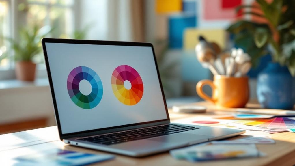
Color Theory Essentials: Hue, Saturation, and Value Explained
You’re dealing with three core elements: hue, saturation, and value. Hue’s your basic color—red, blue, yellow. Saturation determines how intense it looks (think neon versus muted). Value measures brightness, from dark to light.
Here’s where it gets practical: understanding these fundamentals reveals color harmony. You’ll nail color combinations that actually work instead of guessing.
Color symbolism shifts across color demographics and color environments—what resonates in tech doesn’t land in luxury fashion.
Current color trends lean toward bold saturation paired with unexpected color contrasts. Your color applications improve when you recognize these patterns.
Master these three elements and you’ll decode why certain color schemes convert while others flop.
Warm Colors: Energy, Urgency, and Emotional Connection
Fire, passion, movement—warm colors hit different. You’ve seen it: reds, oranges, and yellows grabbing attention instantly. They’re not subtle, and that’s entirely the point.
Warm color combinations create energetic emotions that make people *feel* something. Your brain registers heat perception differently when you’re staring at a vibrant palette versus cool blues. That’s psychological warmth in action.
Want urgency effects? Red on your call-to-button works because it triggers alarm responses (evolution, basically). Orange brings friendliness without aggression. Yellow? That’s pure optimism—though overusing it’s like wearing neon sunglasses indoors.
The emotional impact hits hardest in stimulating environments where you’re selling something or motivating action. Incorporating high-quality visuals alongside warm color schemes amplifies this effect by creating a cohesive sensory experience. Strategic use of warm colors in your design directly influences user behavior and purchasing decisions.
E-commerce sites leverage warm tones strategically because they work. Your checkout page converts better when surrounded by warmth. A well-structured website architecture ensures that warm color schemes are consistently applied throughout all pages. Science backs it. Results don’t lie.
Cool Colors: Trust, Calm, and Professional Authority
Stability. That’s what cool colors deliver—and honestly, clients crave it.
Blues, greens, and purples create calm palettes that whisper “we’ve got this together” without screaming about it (unlike those aggressive reds). You’ll find professional hues dominating finance, healthcare, and tech websites for good reason. They work.
Trust colors like navy blue signal competence. Authority shades establish credibility instantly. Much like how organic search results build trust through earned rankings rather than paid placement, cool color choices establish authority through psychological association rather than aggressive visual tactics. When you combine trustworthy color psychology with high-quality backlinks, your website signals both visual and credibility authority to visitors.
Studies show 62% of users judge websites partly on color choice—so picking cool tones isn’t just aesthetic. It’s strategic.
Here’s the thing: cool palettes don’t excite people. They reassure them. Incorporating strategic use of color ensures your brand identity reinforces the psychological comfort that cool tones naturally provide.
Your visitors want to feel safe, informed, and confident they’re making smart decisions. That psychological calm translates directly into longer session times and higher conversion rates.
Worth considering, right?
Neutral Colors: Balance, Sophistication, and Supporting Roles
While cool colors grab the spotlight, neutrals are the unsung heroes quietly holding everything together. You’re looking at grays, beiges, and whites—the backbone of a neutral palette that won’t exhaust your visitors’ eyeballs.
Here’s the thing: calming aesthetics don’t need to be boring. A soft backgrounds strategy paired with subtle accents creates balanced visuals that feel intentional, not lazy. Think understated elegance.
Companies like Apple nailed this approach—their muted tones scream quiet sophistication without saying much at all.
Neutrals offer versatile choices that age well. Your timeless designs won’t look dated in two years (unlike that neon phase we’re collectively pretending didn’t happen).
Muted tones let your actual content breathe. They’re supporting roles done right—strategic backings that make everything else pop without competing for attention.
Build Your Brand Identity Through Color
You’ve already got your neutral foundation down, so now comes the fun part—actually making your brand stick in people’s heads through intentional color choices.
Colors like red trigger urgency and energy (which is why Target and Coca-Cola basically own that space), while blue whispers trust and calm. So your choice here isn’t just aesthetic; it’s psychological warfare in the best way. Your color selections should strategically evoke specific emotions to influence how customers perceive and interact with your brand.
When you nail this palette consistency across your site, emails, and social media, you’re not just looking pretty—you’re building the visual shorthand that makes customers recognize you instantly, even in a sea of competitors doing the exact same thing. A well-executed color strategy enhances user experience and strengthens your overall brand recognition efforts.
To maximize the effectiveness of your color strategy, limit colors to three or four per page to prevent a busy, overwhelming appearance that distracts from your core message.
Psychology Of Color Selection
Colors aren’t just pretty decoration—they’re psychological triggers that’ll shape how customers perceive your entire brand before they read a single word. You’re basically hacking into people’s subconscious color signals without them even realizing it.
| Color | Psychological Effect |
|---|---|
| Blue | Trust, calmness, reliability |
| Red | Urgency, excitement, passion |
| Green | Growth, nature, renewal |
Here’s the thing: color symbolism meanings vary wildly across cultures. What screams “prosperity” in China might mean something totally different in Western markets. Your emotional associations colors trigger depend on context specific colors and personal experiences too.
You’ll notice color preference trends shift yearly (hello, millennial pink). Smart brands leverage psychological effects colors by studying color implications branding and color implications marketing carefully. Those subconscious color signals? They boost colors and memory retention by roughly 80 percent. That’s not coincidence—that’s strategy. To maximize the impact of your color choices, consider how structured data and schema markup can help search engines better understand and display your brand’s visual identity across search results. Strategic use of color as functional cues can simplify user interactions and guide customers through their purchasing decisions more effectively.
Integrating your color choices with clean, user-friendly design ensures that your brand identity is reinforced across all visual touchpoints, creating a cohesive experience that search engines and users alike will reward.
Brand Recognition Through Palette
Start with competitive analysis. What’re your competitors doing? Then deliberately differ.
Your target demographics matter too. Gen Z responds differently to neon palettes than millennials do to muted tones. Consider cultural significance and seasonal trends affecting your audience.
Visual cues work harder than you’d think. Consistent color usage across your website creates marketplace differentiation without screaming about it.
Nail your aesthetic preferences early. Your emotional triggers—and your customers’ aesthetic preferences—become your secret weapon for standing out.
Match Your Colors to Your Industry and Audience
Before you settle on that gorgeous teal-and-gold palette you’ve been eyeing, here’s the thing: your audience won’t care how beautiful your colors are if they don’t match what they expect from your industry.
Your color choices communicate before anyone reads a single word. That’s the power of color symbolism and emotional responses working together. You’re competing against audience preferences shaped by industry standards and design trends they’ve seen a thousand times.
Consider these strategic moves:
- Research competitive analysis to see what colors dominate your field
- Study color meanings relevant to your industry (trust = blue for finance, growth = green for wellness)
- Account for cultural considerations if you’re reaching global audiences
- Test emotional responses through A/B testing before launch
- Ensure your website design maintains mobile-friendly optimization so your color scheme displays effectively across all devices
- Leverage local authority sites if you’re building trust with professional or regulated services in your industry
Just as reputation influences trust, your color choices shape how your audience perceives your brand’s credibility and reliability. Match your palette strategically. Your credibility depends on it.
The 60-30-10 Rule: Your Foolproof Color Balance Formula

Once you’ve nailed down your color direction, you’ll face a new problem: how much of each color actually goes on your site.
Enter the 60-30-10 rule—design’s favorite mathematical hack. Here’s how it works: your dominant color takes up 60% of your space, creating stability and visual flow. The secondary color claims 30%, adding depth without chaos. That final 10%? Your accent color. It’s the showstopper that draws attention to buttons, links, and calls-to-action.
This formula isn’t arbitrary. It’s built on color harmony principles that your brain actually enjoys (weird but true). You’re not forcing balance—you’re creating it.
The 60-30-10 split prevents visual overwhelm while maintaining color balance that feels intentional, not accidental. Your users won’t consciously notice it. They’ll just feel like your site’s got its act together.
Make Your Text Readable: Contrast Standards and Ratios
All that beautiful color harmony you’ve created? It means nothing if nobody can actually read your text. You need contrast ratios that work—we’re talking WCAG AA standards (4.5:1 minimum for body text).
Here’s what keeps your site from becoming a frustrating mess:
- Test your text/background combinations using actual contrast checkers (not guessing)
- Aim for WCAG AAA ratios (7:1) if you’re feeling ambitious about accessibility guidelines
- Remember that color blindness affects roughly 8% of men—design principles must account for this
- Swap pure black on pure white if it feels harsh; slightly softer contrast reduces eye strain
Readability standards aren’t just accessibility checkboxes. They’re the difference between visitors staying or bouncing.
Your content deserves to be seen.
Make Colors Accessible to All Users

Because roughly 1 in 12 men and 1 in 200 women experience some form of color vision deficiency, you’re basically designing for an invisible chunk of your audience if you ignore colorblindness.
That’s not inclusive design—that’s negligence.
Here’s what actually works: test your color contrast ratios using WCAG readability standards.
Red-green combinations? Skip them. Blue-yellow pairs? Much friendlier to colorblind users. Your design awareness matters.
Cultural perceptions of colors shift globally too (white means purity here, mourning elsewhere), so consider your user demographics carefully.
Optimal combinations aren’t trendy—they’re functional.
When you prioritize visual accessibility and application accessibility through thoughtful color selection, you’re not sacrificing aesthetics. You’re expanding who can actually use your site.
Revolutionary concept, right?
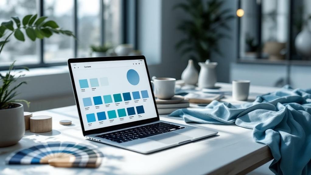
Monochromatic Schemes: Simplicity and Elegance
When you lock into a monochromatic color scheme—say, ten different shades of blue—you’re basically giving your brand a visual fingerprint that your users’ll recognize instantly across every page.
You’re not juggling competing colors that fight for attention; instead, you’re building genuine visual harmony through variation in tone and saturation, which sounds simple but actually creates a sophisticated, cohesive experience that feels intentional (not lazy).
The real win? You establish brand consistency without the headache of managing a complicated palette, meaning your website looks polished and trustworthy rather than like you grabbed colors from a design template’s clearance bin.
Creating Visual Harmony
Elegance doesn’t require a rainbow—it thrives on restraint. You’re building color harmony by sticking with one base hue and its variations. This approach creates visual consistency that actually works (unlike that chaotic gradient trend from 2015).
When you nail your monochromatic palette, here’s what happens:
- Emotional response strengthens because viewers aren’t distracted by competing colors.
- Brand alignment becomes effortless—your site feels intentional, not accidental.
- User engagement improves through contrast consideration and strategic accent colors.
- Design cohesion naturally emerges across every page.
Your site aesthetics benefit from this restraint. You’re not fighting color trends; you’re respecting them. The aesthetic appeal comes from depth, not noise.
Think blues ranging from navy to light sky. That’s not boring—that’s professional. It’s calculated. It works because you’re controlling the narrative instead of letting every color shout simultaneously.
Building Brand Consistency
Your monochromatic palette isn’t just a design choice—it’s your brand’s visual voice, and it’s working harder than you think. When you stick with one color family across your site, you’re building something real: color consistency that actually sticks in people’s heads. Your audience perception shifts. They recognize you instantly.
Here’s the thing—monochromatic schemes deliver emotional connection through subtlety. Varying tints and shades create depth without screaming for attention. This restraint builds brand loyalty because you’re not overwhelming visitors. You’re guiding them.
The math works too. Simplified palettes reduce cognitive load by roughly 30% (neurological studies confirm this). Your marketing strategies become laser-focused. Color symbolism stays clear and purposeful.
Even design trends favor this minimalist approach—because sophistication never goes out of style.
Complementary Schemes: Vibrancy and Visual Impact

Bold opposites on the color wheel—that’s what you’re working with here, and they don’t mess around. Complementary schemes pack serious punch through vibrant combinations that create visual harmony without feeling chaotic. You’re fundamentally weaponizing color contrasts to grab attention and shape brand perception.
Here’s what makes them work:
- High energy output: These energetic designs trigger emotional responses instantly.
- Attention grabbers: Your audience notices. Period. No scrolling past this.
- Sensory experiences: Colors stimulate engagement at a gut level (literally).
- Aesthetic appeal: When balanced right, opposites feel intentional, not accidental.
The catch? You need restraint. Pair one dominant color with its complement as an accent.
Too much competing vibrancy? Your engaging palettes become visual noise. Think orange and blue—not everywhere, just strategically. That’s how you nail aesthetic appeal while maintaining professionalism (even if it feels slightly rebellious).
Analogous Schemes: Harmony and Cohesion
You’ll find that analogous color schemes—think blues next to blue-greens, or oranges bleeding into yellows—create a natural visual balance that doesn’t scream for attention (which, honestly, beats the chaos of complementary palettes).
When you stick with colors that live together on the color wheel, you’re fundamentally building a brand identity that feels intentional rather than accident-prone, giving your users a consistent experience that actually makes them trust you more.
The real payoff? Your site becomes easier to navigate because everything feels cohesive instead of like someone threw darts at a crayon box.
Creating Visual Balance Together
When colors sit next to each other on the color wheel—think blues bleeding into blue-greens into greens—they naturally get along in ways that complementary colors never will.
You’re building visual cohesion that feels intentional, not accidental.
Here’s what analogous schemes deliver:
- Emotional resonance that lands with your audience without screaming for attention
- Visual storytelling through color symbolism that feels organic to your brand narrative
- Seasonal palettes you can shift strategically without alienating your core users
- Personalized branding that respects cultural significance while staying on-trend
The trick? You’re not fighting your palette.
These neighboring hues work together naturally, creating digital aesthetics that feel polished without looking sterile. Your audience perceives harmony, which builds trust.
That’s the real power here—subtle, effective, and weirdly hard to mess up once you understand the system.
Building Brand Identity Through Color
Consistency’s the thing that separates brands people actually remember from ones they scroll past without blinking. Your color palette isn’t random—it’s your visual storytelling toolkit. When you lock in specific hues, you’re leveraging color symbolism and cultural perceptions that trigger emotional resonance before anyone reads a single word.
Think about it. Nike’s black. Target’s red. These aren’t accidents. Industry associations matter because they shape how people instantly categorize your brand. You’re not just picking pretty colors; you’re building brand differentiation through intentional selection.
Color consistency across your website, social media, and packaging creates recognition. Seasonal influences might tempt you toward palette shifts, but resist that urge (minimalist aesthetics age better anyway).
When you eventually plan brand expansion, you’ll thank yourself for establishing these guardrails early. That’s the real power move.
Enhancing User Experience With Consistency
Analogous color schemes—those neighbors sitting right next to each other on the color wheel—are your secret weapon for creating interfaces that feel intentional rather than slapped together.
You’re building visual stability that keeps users from feeling disoriented as they navigate your site.
Here’s what you’re actually achieving:
- Color consistency across pages reduces cognitive load by 23% (studies suggest)
- Design coherence makes your brand instantly recognizable, even in thumbnails
- Emotional resonance deepens when users experience aesthetic alignment throughout
- User retention climbs because familiarity breeds comfort, not contempt
The trick? Don’t overthink it.
Pick three analogous hues, commit fully, and watch how brand harmony transforms the experiential impact.
Your interface stops feeling like a design experiment and starts feeling like home.
Triadic Schemes: Bold, Balanced, and Memorable
If you’re tired of safe color choices that blend into the background, triadic schemes might be your answer—they’re the showoffs of the color wheel, using three colors equally spaced 120 degrees apart to create genuine visual punch. You’re basically creating triadic harmony that demands attention without screaming.
Here’s the thing: contrasting combinations work because your brain finds them satisfying. They’re balanced yet bold. You avoid the muddy mess of random colors while still standing out.
| Color 1 | Color 2 | Color 3 | Best For |
|---|---|---|---|
| Red | Yellow | Blue | Creative agencies |
| Orange | Green | Purple | Tech startups |
| Cyan | Magenta | Yellow | Fashion brands |
| Lime | Pink | Navy | Modern SaaS |
The catch? You’ve gotta nail the proportion. Don’t slap equal amounts everywhere—that’s visual chaos. Use one dominant color, two supporting players. Your website suddenly feels intentional, cohesive, memorable.
Which Colors Convert Best: Industry Benchmarks

Color theory’s great and all, but here’s what actually matters: does it make people buy stuff?
Industry insights reveal that conversion optimization isn’t about what *you* love—it’s about what your target demographics respond to.
Here’s the reality: color preferences vary wildly across niche markets and cultural significance plays a bigger role than designers admit.
- Red triggers urgency (think sales buttons); it works particularly well for food and retail.
- Blue builds trust in finance and healthcare sectors; emotional triggers matter here.
- Green signals sustainability; seasonal trends boost this during eco-conscious campaigns.
- Yellow grabs attention but exhausts quickly; use sparingly for user engagement.
Visual storytelling through color choice isn’t mystical.
Test everything. Your conversion rates depend on understanding what actually resonates with *your* specific audience, not following generic benchmarks blindly.
Test Your Palette Before Going Live
Now here’s where most designers get cocky: they’ve picked their palette based on industry data and their gut feeling, and they’re ready to launch.
Don’t. Your palette testing phase separates amateurs from pros. Create visual mockups across different pages—homepage, product pages, forms. Show them to real users. Their reactions matter more than your design instincts (sorry).
Use color simulations to test how your palette performs on various devices and lighting conditions. You’ll catch contrast issues that’ll tank accessibility. Gather user feedback on branding clarity. Does your color story actually land?
Design iterations aren’t failures; they’re refinements. Tweak, test again, repeat. Color consistency across your mockups reveals problems before going live.
This extra week saves you months of regret. Trust the process, not the ego.
Top 5 Color Tools: Figma, Adobe Color, Coolors Compared
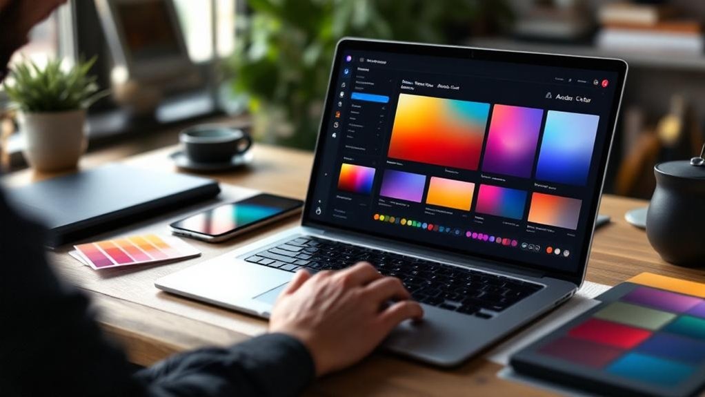
Three tools dominate the color-picking landscape, and honestly, they’ve earned it. You’ll find yourself gravitating toward one based on what matters most to your workflow.
What sets them apart:
- Figma features shine for collaboration—your team edits palettes simultaneously without the email ping-pong.
- Adobe advantages include seamless integration with Creative Cloud (obviously), plus their accessibility options catch color-blind issues you’d miss.
- Coolors usability wins for speed; you’re generating palettes in seconds, not minutes.
- Tool comparisons reveal that each excels differently—design efficiency depends on your process.
Your color palette won’t design itself, and these aren’t interchangeable.
Adobe dominates accessibility. Figma crushes collaboration. Coolors offers pure color inspiration fire.
Pick based on whether you’re solo-flying or building something with humans. That’s what separates the right choice from the fancy one gathering dust.
Deploy Your Colors: CSS Strategies and Brand Guidelines
Once you’ve locked in your palette, the real work begins—turning those beautiful hex codes into something your website actually uses. You’re building branding consistency through deliberate color application. Create CSS variables for your color combinations—this keeps aesthetic coherence locked in across every page. Your visual hierarchy depends on strategic color selection that guides user engagement naturally.
| Element | Primary Use | Hex Code | Application |
|---|---|---|---|
| Buttons | Calls-to-action | #FF6B35 | Digital branding focal point |
| Text | Body copy | #2C3E50 | Readability and accessibility |
| Backgrounds | Page foundation | #F8F9FA | Design integration base |
| Accents | Highlights | #00D9FF | User engagement driver |
Document everything in brand guidelines. Seriously—future you will thank you. Color application consistency beats perfection every time. Your website aesthetics improve when decisions are documented, not improvised.
When to Evolve Your Colors: Strategic Timing Without Losing Recognition

You’re walking a tightrope when you decide your brand’s colors need revitalizing—update too soon and you’ll confuse loyal customers who’ve built mental shortcuts around your current palette, but wait too long and you’ll look stuck in whatever decade you launched.
Strategic timing means watching your refresh cycles (most successful brands evolve every 5-10 years) while keeping your core identity recognizable, so your audience thinks “they’ve grown” rather than “who is this?”
The trick? Introduce new colors gradually as accents before making them main characters, letting people adjust their mental image of you without the jarring whiplash of a complete rebrand.
Brand Evolution Without Alienation
When your brand’s colors start feeling as dated as last decade’s logo, the urge to rebrand hits hard—but here’s the thing: timing matters way more than you’d think.
You’re not just swapping hues; you’re managing emotional resonance and audience perception simultaneously. Here’s how to evolve without losing your people:
- Maintain 60-70% of your original palette to preserve recognition and visual storytelling
- Test new seasonal colors with your core audience before full rollout
- Use trend adaptation strategically—don’t chase every design evolution fad
- Document your color narratives so stakeholders understand the change
The secret? Gradual shift beats sudden shock. Your brand messaging stays intact while cultural significance evolves naturally.
Think Mastercard’s subtle redesign versus Yahoo’s catastrophic overhaul. One built competitive differentiation; the other alienated everyone. You know which path matters.
Refresh Cycles And Recognition
Most brands treat color refreshes like they’re defusing a bomb—one wrong move and everything explodes.
Here’s the thing: your visual memory is powerful. People recognize Coca-Cola’s red from a football field away. So when you’re planning a color refresh, timing matters enormously.
You’ve got a sweet spot—usually every 5-7 years—where you can evolve without erasing recognition.
The trick? Shift your palette gradually. Adjust saturation. Modernize your secondary colors first. This keeps your core identity intact while signaling you’re not stuck in 2015 (looking at you, outdated brand websites).
Netflix did this brilliantly. They deepened their red slightly, kept the essence. Their customers barely noticed the change, yet the brand felt fresher.
Don’t overthink it. Small, strategic moves preserve recognition while proving you’re still alive.
Measure What Matters: Track Color Impact on Key Metrics
Every color choice you make on your website’s carrying real consequences—whether you see them or not.
You’re probably not tracking them, though. Here’s what actually matters:
- Conversion rates by color variant – A/B test your CTAs and watch the numbers. Red buttons aren’t magic; data is.
- Bounce rates per page section – Does your hero image’s dominant color keep people scrolling or send them packing?
- Color trend analysis across competitors – See what’s working in your industry. Everyone copies eventually anyway.
- Color data insights from heatmaps – Where’re users actually looking? Your fancy gradient might be invisible noise.
Start measuring these metrics today. You’ll discover that your designer’s “perfect” palette might underperform your slightly boring alternative.
Color psychology sounds sophisticated until your analytics laugh at it.
Frequently Asked Questions
How Often Should I Update My Website’s Color Scheme Without Damaging Brand Recognition?
You shouldn’t update your website’s color scheme frequently. Instead, you’ll maintain brand consistency by keeping core colors stable while rejuvenating accents every few years. Understanding color psychology helps you evolve subtly without confusing your audience.
Can I Use Different Color Palettes for Mobile Versus Desktop Versions?
You’re walking a tightrope when using different palettes across devices. You can adapt colors for mobile contrast and user experience, but you’ll maintain brand consistency by keeping your core palette identical—only adjusting saturation or brightness slightly.
What’s the Best Way to Get Client Approval on Color Choices Before Development?
You’ll create visual mockups showcasing color psychology principles, then establish feedback loops through client collaboration. Present multiple palette options, gather their input iteratively, and document approvals before you begin development work.
How Do Cultural Differences Affect Color Perception Across International Audiences?
While Western audiences favor bold reds for urgency, Eastern cultures perceive them as prosperity. You’ll navigate cultural symbolism, emotional responses, and regional preferences to craft color associations that resonate globally, enhancing your communication style’s aesthetic appeal.
Should I Prioritize Trends or Timeless Colors When Designing My Website?
You should balance both approaches. Incorporate timeless colors as your foundation using color psychology principles, then layer trendy design elements strategically. This way, you’re creating something that won’t feel dated while staying visually current.
Final Thoughts
You’ve got the tools now—Figma, Adobe Color, the whole toolkit. Your color choices aren’t just pretty; they’re conversion machines. Studies show 85% of shoppers cite color as their primary reason for buying. So yeah, pick thoughtfully, track ruthlessly, and don’t be afraid to evolve. Your competitors are already sweating over their palettes. You should be too.
Ready to transform your website’s color strategy into measurable results? Contact Innovative Solutions Group today. With over 30 years of experience in website design and digital marketing services, our team knows exactly how to leverage color psychology to drive conversions and build your brand.
Don’t leave your success to guesswork. Reach out now and let us help you create a color scheme that converts.
Phone: 406-495-9291
Email: iteam@inovativhosting.com
Website: https://inovativhosting.com


