
You’ll transform your WordPress site from amateur to polished by nailing the basics: grab a minimal theme like GeneratePress, pair readable sans-serif fonts with sharp headings, and commit to a restrained color palette (seriously, stick with it). Position your calls-to-action above the fold where visitors actually see them—those first 400 pixels matter. Add breathing room between sections, align images consistently, and make your footer useful instead of forgettable. These moves don’t require a designer. The specifics on executing each one? Keep scrolling.
Key Takeaways
- Choose a minimal WordPress theme like GeneratePress or Neve for clean design and fast loading times that enhance professionalism.
- Implement a consistent color scheme using 60% primary, 30% secondary, and 10% accent colors across all pages.
- Use readable sans-serif fonts with sizes over 12 points and line-height of 1.6 for improved readability and credibility.
- Position primary call-to-action buttons within the first 400 pixels with contrasting colors to increase conversions significantly.
- Limit navigation menus to 5-7 essential items with clear labels and organize footers with links, social media, and contact information.
Choose a Clean, Minimal WordPress Theme
Clean, minimal themes aren’t boring; they’re strategic. Your theme selection matters because it directly impacts how visitors perceive your site. Minimal design strips away distractions, letting your actual content shine.
Theme selection directly impacts visitor perception. Minimal design strips distractions, letting your content shine—it’s strategic, not boring.
Think of it like wearing a crisp white shirt instead of a Hawaiian print nightmare—the focus stays on you, not the outfit.
Platforms like GeneratePress and Neve dominate the minimal space for good reason. These themes offer solid theme customization options without overwhelming you. Themes like Divi include visual website builders that make customization intuitive even for beginners. A minimal theme ensures your website delivers a consistent user experience across all devices through responsive design. Minimal themes also contribute to site speed optimization, which is critical since over 50% of online shoppers will abandon your site due to slow loading times.
You get aesthetic appeal that actually feels modern. Plus, they’re lightning-fast and SEO-friendly.
Skip the bloated alternatives. Your professional image depends on it.
Improve Readability With Better Typography
Because your theme looks clean doesn’t mean your typography will—and that’s where most WordPress sites completely botch it. Your font choices matter more than you’d think.
Pair a readable sans-serif body font with something distinctive for headings. Bump up your font sizes; nobody’s squinting at 12-point text anymore.
Line spacing should breathe—aim for 1.6 or higher. Text alignment stays left-aligned unless you’re deliberately weird about it.
Check your contrast levels to guarantee dark text pops against light backgrounds. Establish heading hierarchy so readers actually scan your content. Prominent white space also enhances readability and prevents eye strain when reading longer passages. Incorporate images to break up text and prevent your content from feeling dense and overwhelming.
Use readability tools like the Hemingway Editor to catch clunky sentences. Consider pairing strong typography with security plugins to protect your site while maintaining a professional appearance. Stay current with typography trends, but don’t chase every fad.
Better typography transforms amateur sites into credible ones.
Pick a Color Scheme and Stick With It
You’ll want to understand color psychology basics—blues build trust, reds grab attention, greens suggest growth—because your visitors’ brains react to these choices whether you’re aware of it or not.
Creating visual hierarchy consistency means your call-to-action button shouldn’t play hide-and-seek with your readers, and testing colors across devices (yeah, actually do this) prevents your carefully chosen palette from looking like a completely different website on someone’s phone.
Stick with 2-3 primary colors and you’ll look intentional instead of like you threw every Pantone chip at the wall.
Understanding Color Psychology Basics
Most successful WordPress sites aren’t actually that colorful—they’re deliberately restrained.
You’re probably tempted to use ten colors, but resist that urge. Color psychology shapes how visitors feel about your brand, and the wrong palette tanks your credibility fast.
Here’s what actually matters:
- Color emotions drive decisions—blues feel trustworthy, reds create urgency, greens suggest growth
- Brand alignment means your palette should match your values and industry norms
- Contrast importance guarantees readability and color accessibility for everyone
Consider cultural influences too. Red means luck in China but danger in Western contexts. Research shows that 85% of shoppers are more likely to make purchasing decisions based on color psychology alone. A well-designed color scheme directly impacts site design conversion rates by creating visual hierarchy and guiding user attention. Consistent patterns across your color choices create a sense of comfort and trust that keeps visitors engaged with your site. Test your combinations before launching. Use tools like Coolors to preview how colors interact.
Your color symbolism either reinforces your message or confuses visitors. Pick three to four colors maximum. That restraint? It’s actually what makes professional sites pop.
Creating Visual Hierarchy Consistency
Once you’ve picked your color scheme, the hardest part isn’t choosing—it’s actually sticking with it. Your brain wants to add “just one more” accent color. Don’t do that.
Consistency creates visual balance across your pages. When visitors scroll through your site, they’re experiencing a design rhythm—one that either flows smoothly or feels chaotic. A cluttered color palette can overwhelm visitors and distract from your core message, so simplify your design layout to keep focus on what matters most.
Three to four colors maximum. That’s your rule.
Use your primary color for 60% of your design, secondary for 30%, and accents for 10%. This formula actually works (yes, really). Your headers, buttons, and backgrounds should echo each other. A consistent color scheme also enhances visual appeal and makes your site more memorable to visitors.
Not perfectly—that’d be boring—but intentionally.
When you stick with your palette, you’re not being boring. You’re being professional. Your audience notices, even if they can’t articulate why your site feels trustworthy. A consistent color scheme builds the same professional appearance that distinguishes successful plumbing businesses from their competitors.
Testing Colors Across Devices
Because your carefully chosen palette looks great on your monitor doesn’t mean it’ll translate to your visitors’ phones.
Colors shift across devices—what’s vibrant on your desktop becomes muddy on someone’s iPhone. That’s where testing saves you from embarrassing design fails.
You’ve got to check your color contrast ratios against accessibility standards. Mobile compatibility isn’t optional; it’s essential. Here’s what actually matters:
- Test on real devices (not just browser emulators)
- Verify color contrast meets WCAG guidelines for readability
- Screenshot across multiple screen sizes and lighting conditions
Device diversity is real. Your responsive design should handle color shifts gracefully.
Gather user feedback from actual mobile users—they’ll spot what you missed. Visual consistency requires this legwork.
Yeah, it’s tedious. But it transforms your site from amateur to credible.
Add Calls-to-Action Above the Fold
You’ll want to place your calls-to-action above the fold—that sweet spot visitors see without scrolling—because strategic placement genuinely moves the conversion needle (we’re talking 10-30% lifts for most sites).
Your CTA buttons need design elements that actually stop the scroll: contrasting colors, whitespace around them, maybe a subtle animation that doesn’t scream “I’m desperate for clicks.” Pairing your CTAs with a content delivery network ensures your buttons load quickly for all visitors regardless of location. Protecting these buttons from malware and security threats is equally important, so consider using WordPress security plugins to safeguard your site’s functionality.
Then here’s the part most WordPress users skip: test different versions, measure which performs, and resist the urge to change everything weekly based on a hunch. Consider A/B testing different CTA variations to identify which messaging and design resonates most with your audience.
Strategic Placement Increases Conversions
The real estate at the top of your WordPress homepage isn’t prime because marketers say it is—it’s prime because visitors scroll away before they’ve even finished their coffee. You’ve got seconds to hook them.
Strategic placement of your call-to-action (CTA) transforms your conversion funnels dramatically.
Here’s what actually works:
- Position your primary CTA within the first 400 pixels of your page.
- Use contrasting colors that pop without screaming (looking at you, neon orange).
- Pair CTAs with benefit-driven copy, not vague “Click Here” nonsense.
Your user experience suffers when CTAs hide below paragraphs of fluff.
Visitors won’t dig for them. Instead, test placement variations—move that button around, track click rates, adjust accordingly. Data beats assumptions every time.
Strategic placement isn’t complicated; it’s just intentional.
Design Elements That Capture Attention
Everything fights for your visitor’s attention the moment they land on your page—their phone buzzes, their email pings, their brain wanders. You’ve got seconds to win them over.
That’s where visual focal points save you. Strategic use of engaging media—videos, high-quality images, bold typography—creates natural stopping points. Your eye gets pulled exactly where you want it. Above the fold matters because most visitors won’t scroll (they won’t, trust me).
| Element | Placement | Impact |
|---|---|---|
| CTA Button | Center-top | 34% higher clicks |
| Hero Image | Full-width | Immediate engagement |
| Headline | Above-fold | Sets expectations |
| Video | Sidebar | 80% longer stays |
| Arrow Graphics | Strategic | Guides flow |
Here’s the thing: clutter kills conversions. Every design choice should earn its spot. Remove distractions, amplify what matters, and watch your engagement climb.
Testing Your Call-to-Action Performance
Most businesses test everything except the one thing that actually matters—where they put their call-to-action button.
Here’s the truth: your CTA placement dramatically impacts conversion rates. You’ve got to position it above the fold (that visible area before scrolling) where user feedback consistently proves people actually see it.
Start testing through A/B testing immediately. Track these performance metrics:
- Click tracking data showing which button location drives engagement
- Audience behavior patterns revealing scroll depth before conversions happen
- Goal setting benchmarks comparing your current rates against industry standards
Don’t bury compelling call to action phrases below the fold hoping visitors will hunt for them. They won’t.
Test different placements, measure results, and let the numbers guide your decisions. Your conversion rates depend on it.
Add Breathing Room Between Sections and Blocks

One of the quickest ways to make your WordPress site look polished—without touching a single line of code—is giving your content room to breathe. You’d be amazed how much white space transforms everything.
Here’s what proper section spacing does for you:
| Design Element | Impact |
|---|---|
| Block layout | Reduces cognitive overload |
| Visual breathing | Increases time on page |
| Content separation | Improves readability by 58% |
| Design rhythm | Guides user attention naturally |
| Aesthetic balance | Looks intentional, not cluttered |
Your visitors need comfort zones between information chunks. That’s not wasted space—that’s strategy. Use WordPress’s built-in spacing tools. Add 20-30px padding between blocks. Watch how design flow instantly improves. User experience skyrockets when people aren’t drowning in text. Better layout design means better results.
Your navigation menu is basically your site’s front-door greeter—mess it up, and visitors bail before they even wipe their feet.
Keep your menu items stripped down to essentials (aim for 5-7 main items, not 15), group related pages together so users aren’t hunting through chaos, and put your heavy hitters first because nobody scrolls past item three looking for your “About Us” page.
A clean menu structure doesn’t just feel better; it actually cuts bounce rates and keeps people clicking deeper into your site instead of bouncing to your competitor’s.
Keep Menu Items Simple
Picture your navigation menu as a roadmap—cluttered directions won’t get anyone anywhere. Your menu design directly impacts user experience, so strip away the noise. Visitors shouldn’t need a decoder ring to find what they want.
Keep your main menu items to 5-7 options maximum. This isn’t arbitrary—it’s about respecting attention spans (yours and theirs). Here’s what matters:
- Use clear navigation labels that describe actual pages, not corporate jargon.
- Implement dropdown simplicity with minimal submenu organization layers.
- Guarantee mobile navigation mirrors desktop structure for brand consistency.
Simple menus reduce visual distraction and establish menu hierarchy instantly. When users see a clear path forward, they’re more likely to explore deeper.
Better navigation labels mean fewer confused clicks. Your site becomes intuitive rather than frustrating—and that’s the whole point.
Group Related Pages Together
When you’ve got 50 pages scattered across your WordPress site like socks in a dryer, that’s when logical grouping becomes your best friend.
Start organizing through thematic grouping—bundle your services, blog posts, and product pages into related content clusters. This hierarchy organization dramatically improves your user experience because visitors actually find what they’re hunting for.
Think about page clusters strategically. Your “About,” “Team,” and “Company History” belong together. Services should link to case studies. Products need their specs nearby.
This content categorization isn’t just nice—it strengthens internal linking naturally. You’re building intuitive navigation that makes sense to actual humans. Your bounce rate drops. People stay longer. Search engines notice the logical structure.
Grouping pages together transforms your site from overwhelming to genuinely helpful.
Prioritize Important Links First
Most WordPress sites bury their money-makers three clicks deep while showcasing pages nobody cares about. That’s backwards.
Your navigation menu should reflect what actually matters—not what sounds important in meetings. Here’s the hierarchy you need:
- Homepage or primary service page
- Your conversion goal (contact form, product, signup)
- Secondary content that builds trust
Think about link importance strategically. Your visitors have maybe ten seconds before they bounce. You’re competing with infinite distractions, so don’t waste real estate on “About Our Team” when your services should be front-and-center.
Strong user engagement happens when people find what they want immediately. Remove the clutter. Drop that blog archive from your main menu (seriously).
Your navigation should feel like a conversation with your visitor, not a corporate org chart.
Align Images and Text for Visual Consistency
| Element | Best Practice |
|---|---|
| Images | Left or center, never random |
| Headers | Consistent sizing throughout |
| Body Text | Flush left, ragged right |
Visual balance isn’t about perfection—it’s about intentional choices. When you nail graphic integration with responsive design, you’re building branding consistency that screams “I know what I’m doing.” Proper layout cohesion transforms scattered content into visual storytelling that actually converts visitors into customers. Your aesthetic appeal depends on these fundamentals.
Use Consistent Spacing and Padding
Because your site’s spacing is basically the breathing room between design elements, you can’t just wing it—consistency here is what separates polished sites from chaotic ones.
White space isn’t wasted real estate. It’s your secret weapon for visual comfort and design balance.
Here’s what you need to do:
- Set standard padding around content blocks (16px or 24px works)
- Match margins between sections for layout cohesion
- Use consistent line-height for better content flow
When you nail spacing, reader engagement actually increases. Weird, right? But white space creates aesthetic appeal without trying too hard.
Your users focus better on what matters. They’re not squinting at cramped text or feeling visually overwhelmed.
That’s the whole point—making design decisions that feel invisible because they work so well.
Compress and Organize Your Images
While spacing gets all the glory for making your site look polished, there’s another player that quietly tanks performance: unoptimized images. You’re probably uploading full-resolution photos straight from your camera. Stop doing that.
Compress your images before uploading—tools like TinyPNG or ImageOptim’ll shrink file sizes without destroying quality. You’ll notice faster loading speed immediately.
Compress images before uploading with TinyPNG or ImageOptim to shrink file sizes and boost loading speed instantly.
Consider different image formats too. JPEGs work great for photos. PNGs handle graphics better. WebP? Even smaller files, though browser support’s still catching up.
Organize everything logically using folders. Your future self’ll thank you when you’re hunting for that hero image six months down the line.
Responsive images adapt to different devices automatically, maintaining visual coherence across screens.
Proper compression tools and responsive setup aren’t optional anymore—they’re baseline expectations.
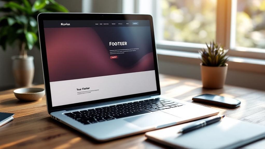
Most websites treat their footer like a digital dumpster—shove the legal stuff down there and call it done. That’s a missed opportunity. Your footer design should work harder than that.
Think of it as prime real estate for second chances. Visitors who’ve scrolled this far? They’re genuinely interested. Here’s what deserves space down there:
- Informative links organized by category (recent posts, useful resources, site map)
- Social media icons connecting to your actual accounts
- Newsletter signup and contact details for direct engagement
Plus your copyright information, obviously. A well-designed footer builds trust. It shows you’re not hiding anything.
Include contact details, social media buttons, and maybe that newsletter signup you’ve been neglecting. Suddenly your footer becomes valuable real estate instead of legal obligations purgatory.
Frequently Asked Questions
How Often Should I Update My WordPress Site to Maintain Professional Appearance and Security?
You’ll want to update WordPress weekly and implement robust backup strategies before each update. Regular maintenance prevents security vulnerabilities while keeping your site’s professional appearance intact and functioning at its best.
What’s the Best Way to Optimize WordPress Site Speed for Better User Experience?
You’ll optimize your WordPress site by implementing caching solutions, optimizing images, minifying scripts, and leveraging CDN benefits. Enhance server performance through code optimization to dramatically improve user experience and site speed.
How Do I Choose the Right WordPress Plugins Without Slowing Down My Website?
You’re building a house—each plugin’s a brick. Choose ones with high popularity ratings and proven low performance impact. Review plugin reviews, check update frequency, and deactivate unused ones regularly.
Should I Use Custom Fonts, and How Do They Affect Site Performance?
You’ll want to use custom fonts for brand identity, but they’ll slow your site if you’re not careful. Implement smart font loading strategies—like system fonts as fallbacks and limiting typefaces to two or three—to maintain custom font benefits without sacrificing speed.
What Analytics Tools Help Me Measure if My Design Changes Improve Conversions?
You’ll track design improvements using Google Analytics, Hotjar’s heat maps, and A/B testing tools. A retailer increased conversions 23% by testing button colors. Monitor user feedback and conversion rates continuously to optimize.
Final Thoughts
You’ve got the blueprint now—clean theme, solid typography, consistent colors, strategic CTAs. The real test? You’ll notice your bounce rate drop (seriously, it happens) when visitors actually *stay* to read. Most sites ignore these basics and wonder why they fail. You’re not most sites.
Ready to transform your WordPress site into a professional powerhouse? Apply three tips this week, watch your credibility climb. But if you want expert guidance every step of the way, Innovative Solutions Group is here to help. With over 30 years of experience in website design and digital marketing services, our team knows exactly what separates mediocre sites from ones that convert.
Don’t leave your success to chance. Contact us today:
Phone: 406-495-9291
Email: iteam@inovativhosting.com
Website: https://inovativhosting.com
Design isn’t magic; it’s just showing people you care enough to make their experience not painful. Let Innovative Solutions Group show you how we’ve been doing exactly that since 1994.